Ahmed Soliman

Websites for Washington's firms

Your reputation walks into rooms without you.

The website should keep up.

I design and write websites for Washington's contractors, consultancies, associations, and public affairs firms.

  • Government contractors
  • Consultancies
  • Associations
  • Public affairs & strategic communications
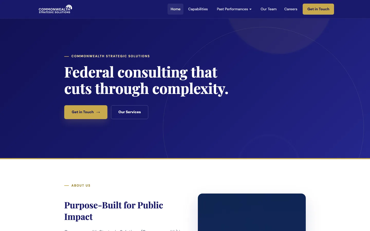
The rebuilt Commonwealth Strategic Solutions homepage: a navy page with the headline “Federal consulting that cuts through complexity.”
The old Commonwealth homepage: a stock photo of a bridge at night with the headline “Powered by bold ideas.”
After
Commonwealth Strategic Solutions. Drag to compare the GoDaddy template it had with the site it has now.
01

The thirty-second read

Most firms in this town have a site that was built once and left alone while the reputation kept growing. The people who look you up, partners, prospective clients, members, reporters, and the people you want to hire, are trying to confirm three things.

  1. What do you do?

    In one sentence, for one kind of client. Not a paragraph about passion and excellence. If the headline could sit on any firm's site, it is not doing its job.

  2. Where have you done it?

    Past performance, client work, or member results, named where you can name them, and proof a reader can repeat to someone else. Each engagement gets its own page, written like a case study, not a logo wall.

  3. How do I reach you, and can I trust you?

    The credentials your buyers look for, whether that is certifications and NAICS codes or a client list and press, plus real names and faces and a contact page that gets to a person.

Does your website give people an accurate picture of your work, expertise, and value?

Nine reasons a website falls behind the organization
02

Start with a free review of the site you have

Send me your URL. Within two business days you get a short written review: what a visitor sees in the first thirty seconds, what is missing, and what I would change first. It is specific to your firm, not a template. No call required, and no obligation.

Send me your URL
Site review

What I look at

1Does the first screen say what you do, for whom, and why it matters?

The one line every visitor reads. It should name the work and the people you do it for, in words no one else in your field could borrow.

2Does the site describe the organization you are today?

New capabilities, new leadership, the last two years of work. Before I review, I ask you one question: what has changed in the organization that the website has not caught up with? Then I check whether a visitor could tell.

3Is your strongest work easy to find, understand, and share?

The projects, publications, or results that prove the point: one click from the homepage, each explained in a sentence a reader can pass along.

4Can a reader see why you, and not the firm next door?

Specialties, clients, credentials, the way you work. The things people compare before they email, visible without digging. For contractors, that includes certifications and vehicles. And whether the design itself, the type, the imagery, the layout, matches the quality of the work. Visitors read that as a signal too.

5Does the site give people concrete reasons to trust you?

Named projects, results, the expertise of your staff, recognition from outside. Not whether the language is confident, but whether there is evidence behind it.

6Could a contact forward one link and let it make the introduction?

Most new business starts with a name passed along. The site should finish the job: one page that explains you to someone who has only heard of you.

7Does each audience have a clear way through, and a clear next step?

Clients, members, candidates, funders, press. Each arrives with a different question and should find the answer in a click or two, then know whom to contact, what to ask, and why to join, attend, or apply.

8Can people easily use the site and complete important tasks?

Contact, join, apply, register, download, each tested on a phone. Forms, links, and the basics of accessibility: contrast, keyboard, structure. Then I note whether the platform underneath can grow with you.

03

Four sites, start to finish

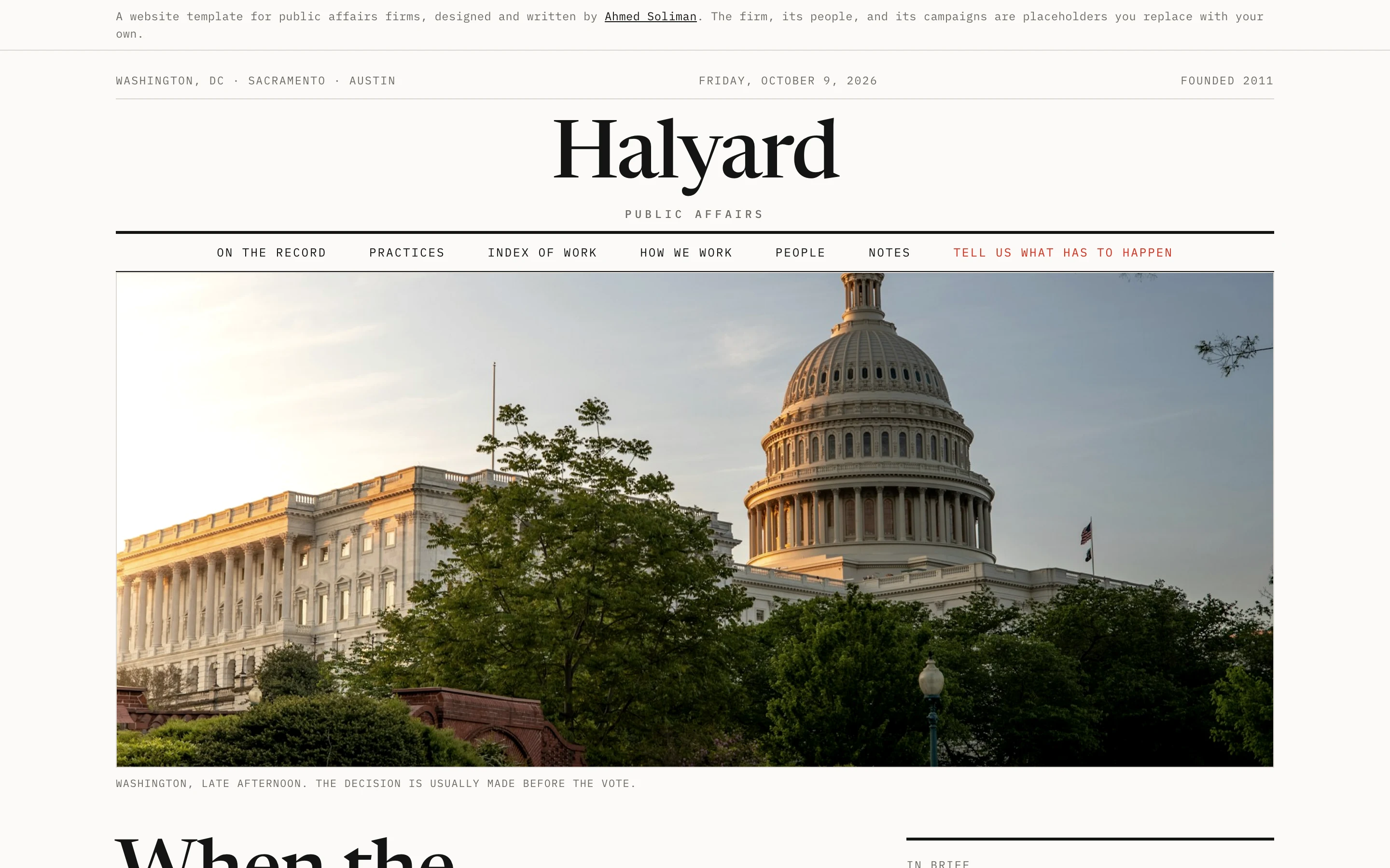
A website for a federal contractor, a website for a web app, a website for an iPhone app, and a website for a proposal workspace. On each I did the strategy, the structure, the copy, the design, and the build.

The live cw-ss.com homepage

Website for a federal contractor · cw-ss.com · 2026

Commonwealth Strategic Solutions

A Service-Disabled Veteran-Owned Small Business serving the VA and NIH. Its old GoDaddy site opened with a stock photo and the line “Powered by bold ideas.” The new site in Webflow leads with what the firm does, gives the VHA, VEO, and NIH work a page each, and puts certifications, services, and careers where buyers look for them. Strategy, brand identity, structure, design, and every page of copy. Made with the leadership team, where I work.

  • Strategy
  • Brand
  • Copy
  • Design
  • Webflow build
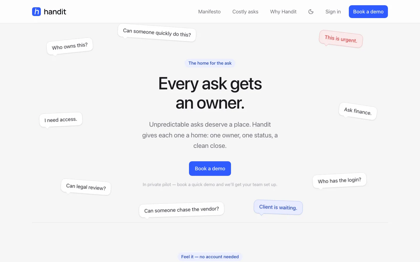
The handit.to homepage: “Every ask gets an owner.”

Website for a web app · handit.to

Handit

The website, name, voice, and manifesto for Handit, a web app that gives every small request at work one owner and one status. The site had to explain a new category in a sentence and get a team lead to book a demo. In private pilot.

  • Naming
  • Copy
  • Design
  • Build
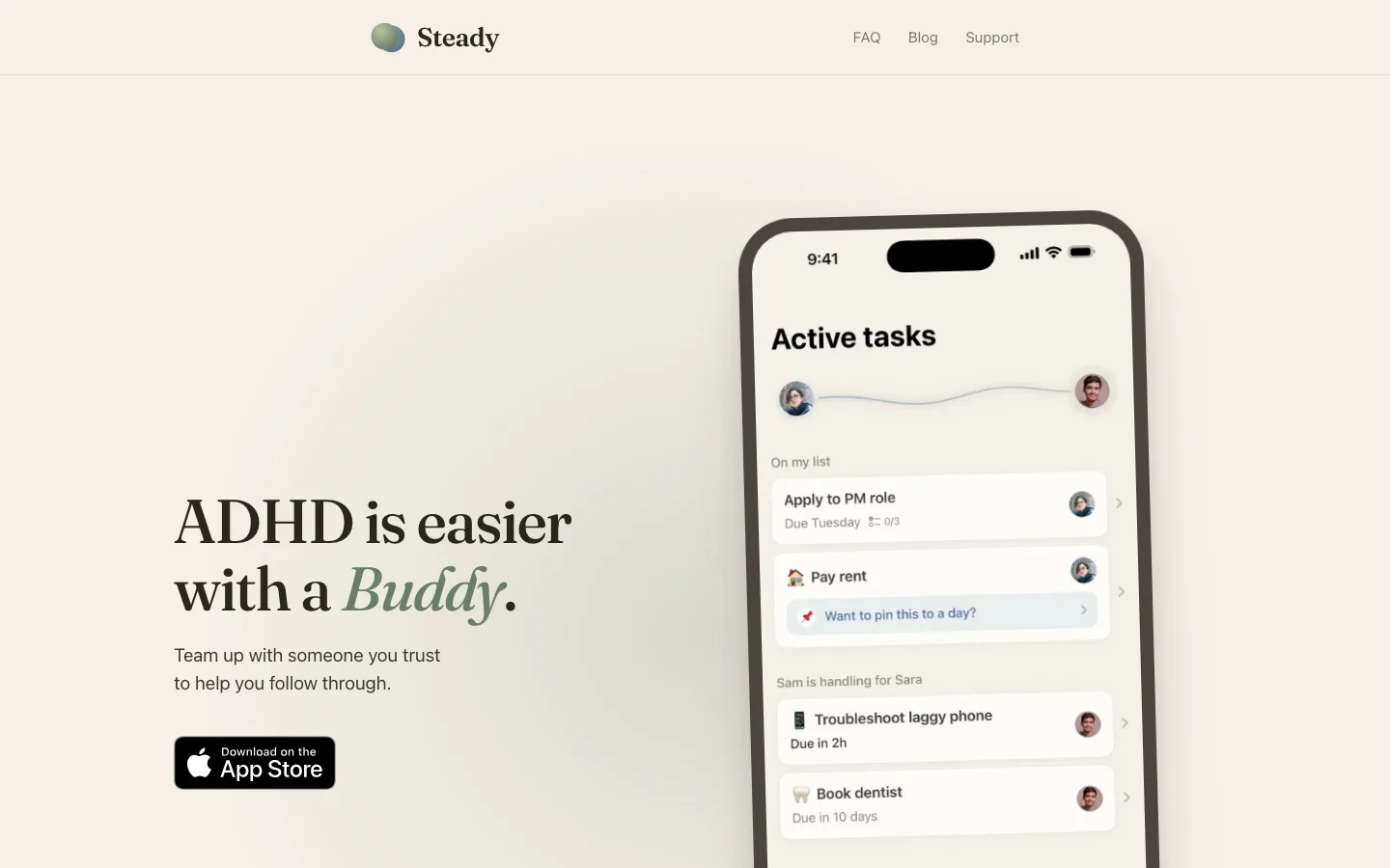
The steadypair.com homepage: “ADHD is easier with a Buddy.”

Website for an iPhone app · steadypair.com

Steady

The website and brand for Steady, an iPhone app that pairs someone with ADHD with a person they trust. A calm page for a sensitive subject: one promise, one screenshot, one button. Live on the App Store.

  • Brand
  • Copy
  • Design
  • Build
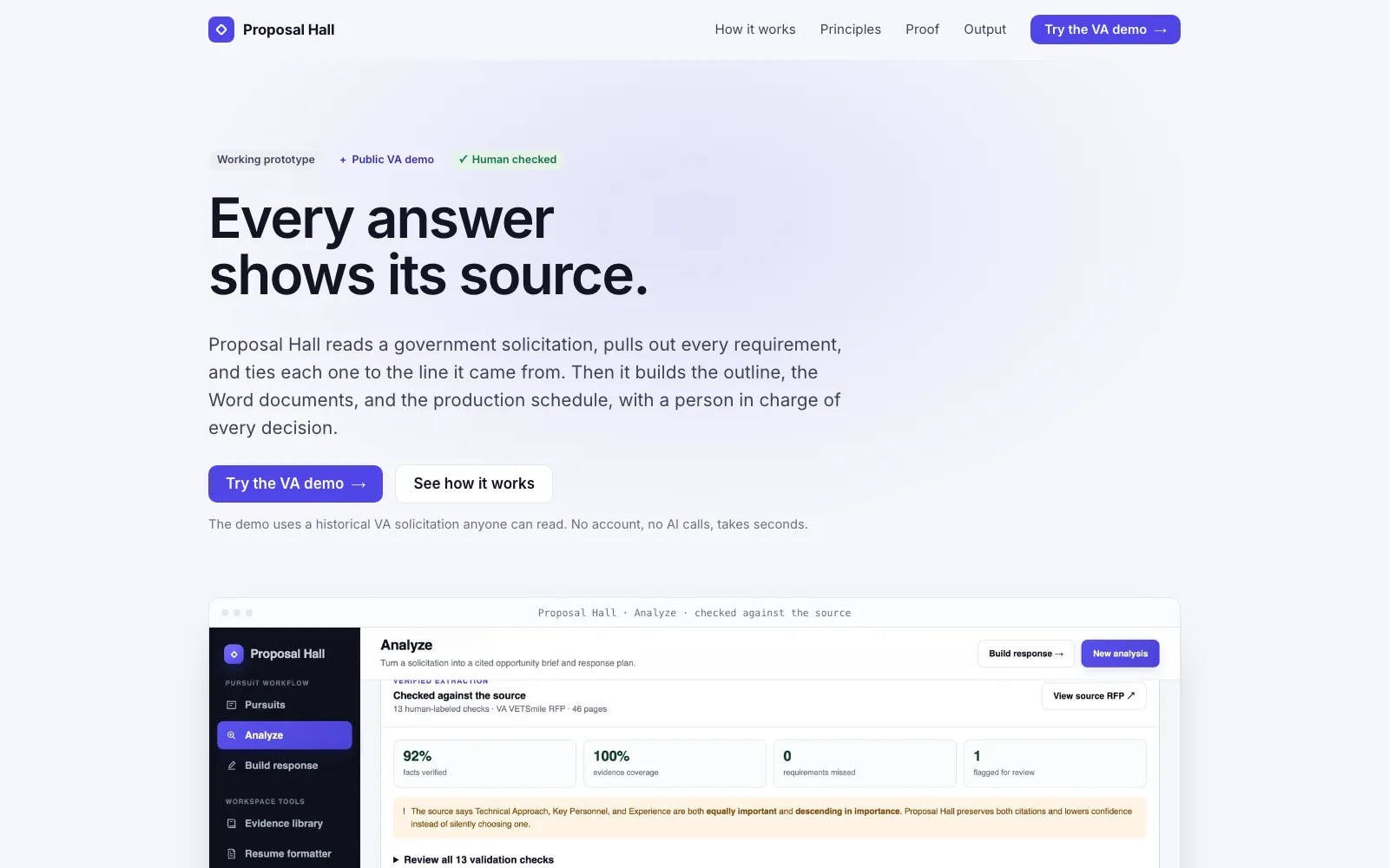
The Proposal Hall website: “Every answer shows its source,” above the Analyze screen checked against a VA solicitation

Website for a proposal workspace · Proposal Hall

Proposal Hall

The website for Proposal Hall, an AI-assisted proposal workspace for government contractors. It had to sell a tool that asks for trust, so the page shows its work: the benchmark against a real VA solicitation, the one conflict it flagged on purpose, and the small labels that admit doubt. Working prototype with a public demo.

  • Copy
  • Design
  • Build
04

How it works

One person does the whole job, so nothing gets lost between the strategist, the writer, the designer, and the developer. There is only me.

  1. 1

    Review

    You send a URL. I send back a written review of what a visitor sees, what is missing, and what I would change first. Free.

  2. 2

    Positioning and structure

    One sentence that says what you do and for whom. A site map that follows the questions a buyer asks, in the order they ask them.

  3. 3

    Words and design

    I write every page, including the case studies, and design a system formal enough for a federal reader and warm enough to feel like you.

  4. 4

    Build and launch

    Built in Webflow or as a fast hand-coded site, accessible by default, on a platform you own and your team can edit. Then it goes live.

05

And once the website is done

The firms that need a better site usually also run a few things on email and spreadsheets: intake, approvals, proposal prep, status updates. I build small internal tools and AI-assisted automations for exactly that kind of work. It is a second conversation, not the first one, so ask after the review.

Ahmed Soliman
06

I have sat on your side of the table

I work at a federal contractor in the DC area, where I rebuilt the company's website and wrote its public past-performance pages for the VA and NIH work. I know what a prime's small business office asks for, what a market-research email looks like, and how much a site has to carry before anyone picks up the phone.

Outside work I design, write, and build my own products, which is where the Handit and Steady sites come from. I write in plain English and build things that are quiet, fast, and accessible.

Send me your URL.

One line is enough. You will hear back within two business days with the review, and nothing else unless you ask.